 SIGN IN
Startup School 2018 continues into week 3. This week we are staring at retention curves!
This week's lectures:
This talk was mostly about growing a business with a proven product. Choosing "when to learn" is tricky. It's difficult to absorb material that isn't yet relevant but the moment it does become relevant, the last thing you have time for is some patient learning! So this was a time to pay attention and be well armed for the future.
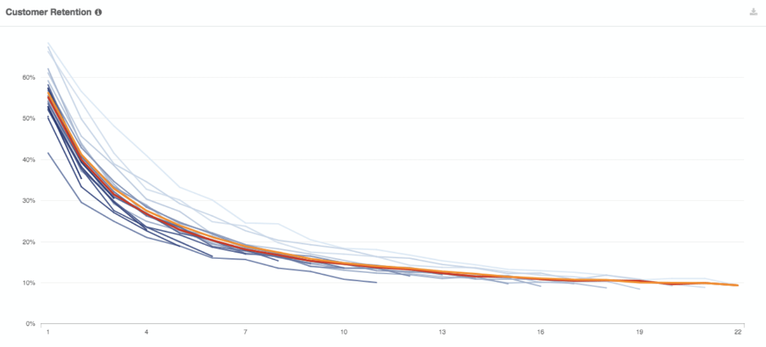
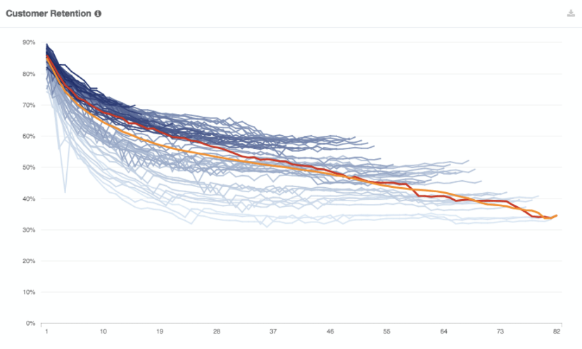
We covered everyone's favourite topic again: product market fit. Gustaf gave a new way to identify it by using retention curves:
Blue Apron
Maybe not product market fit: 50% retention after 1 month, 10% after 24 months
 blue apron
Netflix
Definitely product market fit: 70% after 12 months. 30% after 7 years!
 netflix
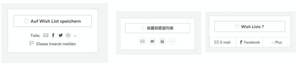
A fun exercise to introduce AB testing was to test our design chops against experiments AirBnb has actually run:
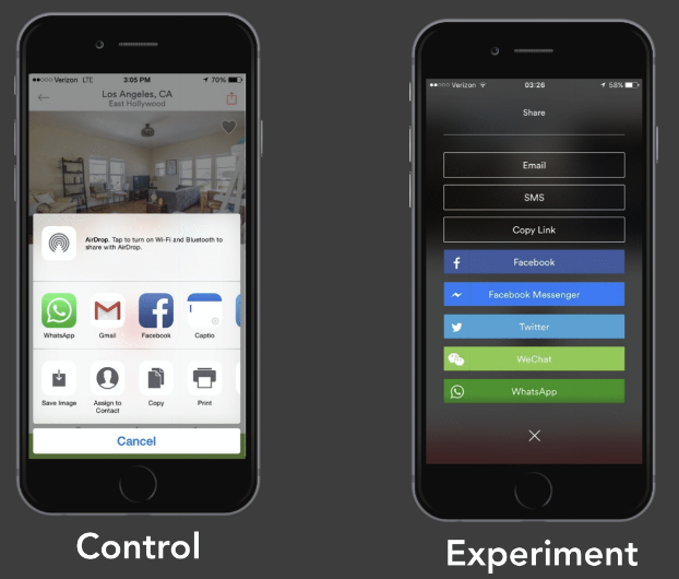
I am not a fan of the default Apple dialog. I have spent ages stabbing these buttons trying to get a 100 Mb pdf to open. It crams a load of disparate actions into a fiddly UI and the operations have little feedback and often fail. So the question becomes, is more colour, space and single purpose better than a fairly awful but familiar default? I said definitely and it indeed won comfortably with a strong +40% result.
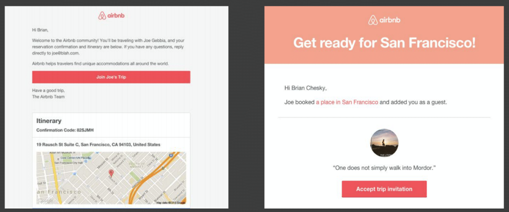
This one was presented as just a button change but it's a radical redesign of the email. The button name "Accept trip invitation" is definitely a stronger call to action. It sounds mandatory to go on the trip. The first one of "Join Joe's Trip" is not a comprehensible action and sounds optional. However, I was troubled by the second email design. I think the huge colourful header makes it feel like a disposable reminder and distracts from the call to action which is pushed way down the page and risks being below the fold. The button on the first email attracts your attention immediately. Given the email design, I plumped for the first email and was wrong. The second gave a +14% improvement. I would like to know how the better CTA performed in the first email design because I suspect it beats both of these.
This one is cheating! German and Chinese will give English speakers some special brain-ache. Trying to put this aside, it seems fairly clear that the third option is the strongest. It has the fewer options, bigger buttons and explanatory text for the rubbish icons. The buttons in the first and second are tiny and unclear. The first version is dominated by an "Ad report" button and the share buttons are not even clearly buttons. The results seemed pretty predictable with increases of +18%, +52% for the new alternatives.
This was the not the most convincing argument for AB testing. There appeared to be some fairly obvious design issues in what was presented. Modern startup dogma suggests that humans cannot make good design decisions and we must always defer to data. I suspect we don't yet understand what is lost when we optimise for a specific actions like this. I feel that early products often have more authenticity which is lost when they no longer have someone with taste and intention caring for them.
I was not sure which way this would go. Would it be a pure MixPanel sales pitch or a tough statistics lesson? In the end it turned out to be a self-effacing look at MixPanel's early days with some nuggets dropped along the way.
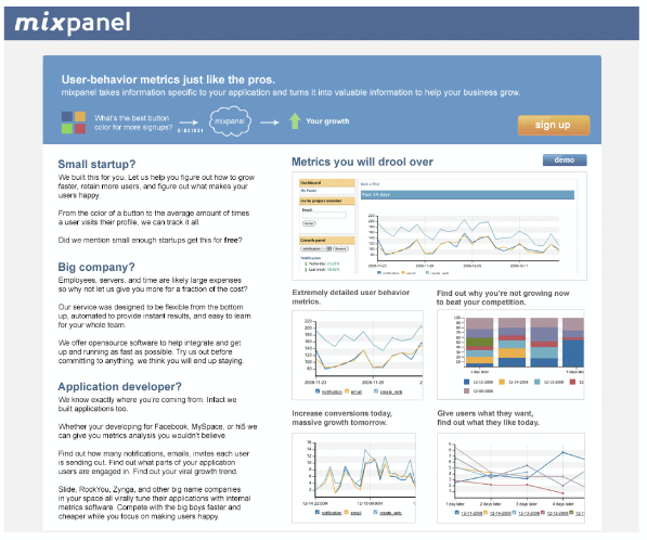
I must confess to quite liking the page. I understand it and I can feel someone earnestly presenting something to me in a straight-forward way. "Metrics you will drool over" might be a bit naff, but I've heard worse although the charts seem fairly run of the mill even for the Office 97.
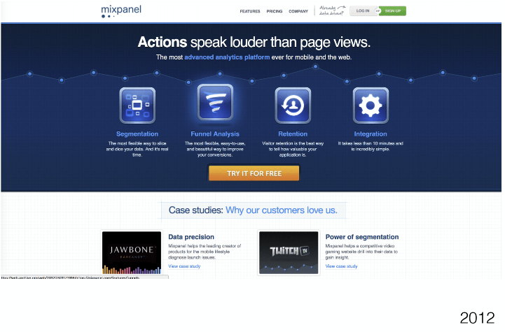
The later version has glowing buttons, clever phrases and handwriting-fonts to call-out buttons etc. It has the smell of a wordpress template not a person with something to say. I can see why it would convert better but it has no soul.
My favourite nugget was that what you concentrate on in the early days e.g. "is my product easy to understand" are not tasks you complete, they are things you work on continuously for the life of the company. This matters because it's so easy to look at what you have done and beat yourself up because it is "still not right". If we internalise Suhail's idea, it means that we can be more forgiving and enjoy discovering the better versions of what we are doing as a continuous process.
Other nuggets:
Less is more - pick on north star metric and monitor up to 3-5 more
Poor retention is often the most ignored metric by early founders
I didn't really understand this passage from Suhail:
"It didn't take very many users and it was like one point, four daily actives would like reduce churn to like a dollar churn to like to sub 10%, it's incredible."
I don't understand how "four daily actives" reduced churn. Is he just saying they are correlated? I also don't know what the incredible bit is ! Is it that sub 10% is good?
Crypto. Meh!
There are 100s of deals available through SUS. To be honest, most of them are little more than the standard trial you could obtain in other ways. The one exception is Digital Ocean offering $30k of credits. Wow. Lots of respect to them. That gesture is likely to be a decisive difference in the lives of many start-ups. I expect they have some interesting math about how much it will actually cost them. A lot of new businesses could go very far with just a $10/mo droplet. They win best deal and earn themselves some free review: I have found them very easy to use, never had a problem, so give them a go.
Otherwise it's been pretty quiet. I have seen some posts with dubious technical advice... I could dive in with a correction but "correcting people on the internet" is unlikely to be welcome and not a good use of precious time.
It's a good sign that the forum isn't just Reddit gossip but it could be a better venue for learning. There was an AMA on DevTools and B2B. I asked a question and it didn't get answered. Most of the early questions didn't get answered due to the forum's newest first sort. I asked the above question about Suhail's video and that too hasn't been answered.
Everyone made it! Fairly quick updates. Each update starts with you describing your business. The reason is that it's one of the hardest things to get right and should be continuous effort to improve. The Thorny one-liner I am currently trying is:
Thorny is an interactive notebook for making tough decisions
I gave Thorny, it's first User demo and testing session. Overall I probably learned more about how I need to run such sessions than about the product.
One notable thing to come out of the session was the user comparing against Excel and expecting to perform Multi-criteria Decision Analysis e.g. for making data intensive decisions like big purchases. In those cases you do want big tables of numbers which is a perfect fit for a traditional spreadsheet. Competing against Excel is an infamous start-up graveyard.
What Thorny does better, is a different type of decision: it's the torrent of small decisions you face when designing and building things. These decisions are less data-driven but argumentation based. This has an interesting application when designing an MCDA decision in spreadsheet - the design decisions have a radical impact to the end result e.g. choosing the statistical treatment of data, how to weight criteria etc. These decisions get hidden in a spreadsheet and made to look like "facts" but they often dictate the final result more than the source data. Thorny's sweet spot and Excel's weakness is transparently handling a high quantity of argumentation based design-decisions and their impact. I need to work out how to capture that in the one-liner!
To improve my user test and interviews, I have read the The Mom Test. It's a pretty good book for customer interviews and some of it can be applied to demos too. It's clearly written for interviewing Americans because it concentrates on overcoming complements. This is not always the hurdle you face in Europe! There are plenty of Europeans who are not shy about putting the boot into a new idea. It's like a sport for us. For us Brits, rather than complementing what we dislike, we are fond of complaining about things we love. If something is worth complaining about, it matters. We will signal our disinterest but won't be too cruel about it.
Some useful titbits:
“It’s easy to get someone emotional about a problem if you lead them there”
This is insightful - emotional intensity doesn't necessarily indicate a pain that needs to be solved. We can evoke our interviewee's passions and it's meaningless if they never feel it without your help. This is quite tricky for decision-making. It's a tacit activity and people are not always aware of what they are doing until pointed out to them.
The pattern of "good questions" in the Mom-test is that they assume nothing and lead nowhere other than to prompt elaboration. I often want to talk about a specific thing with a user but means to lead them. To get authentic responses, the recommended questions remind me of the generated questions from the Eliza bot e.g. "why bother?".
I like the Complainers vs. Customers distinction:
“Someone should definitely make an X!” “Have you looked for an X?” “No, why?” “There are like 10 different kinds of X.” “Well I didn't really need it anyway.”
This happens too often when a discussion is about ideas and novelty.
Did you google solutions?
I love this as a question for seeing through the complainer vs. customer haze. When you discover what people are actively looking to solve, it filters out the empty complaining and means you have also discovered a channel to reach them.
“You should be terrified of at least one of the questions you’re asking in every conversation.”
This is an interesting prompt. For me this isn't about soliciting negative feedback. Negative feedback is likely to cover things I already torture myself with. If anything, hearing someone voice them is a cathartic release. What I find difficult are "asks" e.g. asking to be referred to someone else, asking for a favour or asking for money etc.
“When you fail to push for advancement, you end up with zombie leads: potential customers (or investors) who keep taking meetings with you and saying nice things, but who never seem to cut a check. It's like your startup has been friend-zoned.”
"friend-zoned" is the perfect description of zombie-leads. It's what I must avoid by being less timid about advancement!